C++ GUI Library for Windows Desktop Applications
A powerful C++ component library for the development of Windows Desktop Applications
When C++ Talks Like C# and Java
What is SavvyUI?
SavvyUI is a modern C++ GUI library for building high-performance Windows desktop applications. It provides a rich set of native UI controls including grids, charts, dialogs, tree views, and form components. Designed for developers who want the power of C++ with the ease of modern UI frameworks.
Build Modern Windows Apps Faster with C++
Download SavvyUI and start building powerful desktop applications today.
Terms of use: You are free to use this library at no cost while developing your Windows application. However, a valid license is required before the application is released. This applies to all types of deployments, including commercial products and internal use within your organization. Please ensure that all released applications are properly licensed, as this policy is strictly enforced.
Features of SavvyUI
Key Features
- Native Windows C++ UI components
- High-performance rendering
- Customizable themes and styles
- Rich controls: grids, charts, dialogs, editors
- Lightweight and easy integration
SavvyUI is a feature-rich Windows C++ component library for the development of Windows Desktop applications. It features a large set of basic and advanced built-in components that can be used to create complex UI applications using C++. All the components have a familiar look and feel, and they are exceptionally easy to use. The library comes with built-in and customizable theme.
C++ Components Showcase
Accordion Component
The Accordion component allows users to expand and collapse sections of content. It helps organize large amounts of information in a compact and user-friendly way. Ideal for FAQs, settings panels, and navigation menus.

class AccordionDemo : public GridPanel
{
	Accordion _accordion;

	ButtonDemo _buttonDemo;
	ButtonGridDemo _buttonGridDemo;
	ButtonMenuDemo _buttonMenuDemo;
	TreeViewDemo _treeViewDemo;

public:

	AccordionDemo()
	{
		_accordion.addPanel(L"Buttons", &_buttonDemo);
		_accordion.addPanel(L"Button Grid", &_buttonGridDemo);
		_accordion.addPanel(L"Button Menu", &_buttonMenuDemo);
		_accordion.addPanel(L"Tree View", &_treeViewDemo);

		setMargin(0);
		setLayout({ -1 }, { -1 });
		addComponent(&_accordion, 0, 0);
	}
	~AccordionDemo() {}
};
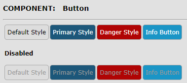
Button Component
A **button component** is a fundamental interactive element in user interfaces, designed to trigger an action or event when clicked or tapped. Typically styled to stand out visually, a button can include text, icons, or both to clearly indicate its purpose—such as submitting a form, opening a dialog, navigating to another page, or executing a function. Button components can vary in size, color, shape, and state (e.g., active, disabled, loading) to convey hierarchy and interactivity. They are essential for guiding user interactions, and when implemented with accessibility in mind, they ensure a responsive and inclusive user experience across all devices and input methods.
class ButtonDemo : public FluidPanel, public ActionListener
{
	Button _buttonDefault;
	Button _buttonPrimary;
	Button _buttonInfo;
	Button _buttonDanger;
	Button _buttonSuccess;
	Button _buttonWarn;

	Button _buttonGray;
	Button _buttonLightGray;
	Button _buttonBlue;
	Button _buttonLightBlue;
	Button _buttonTeal;
	Button _buttonCyan;
	Button _buttonPink;
	Button _buttonIndigo;
	Button _buttonOrange;
	Button _buttonBrown;
	Button _buttonSilver;
	Button _buttonRed;

public:

	ButtonDemo()
	{
		_buttonDefault.setButtonType(ButtonType::DEFAULT);
		_buttonDefault.setText(L"DEFAULT");
		_buttonDefault.setImage(IconSource(L"deliveryorder.gif"));
		_buttonDefault.addActionListener(this);
		_buttonPrimary.setButtonType(ButtonType::PRIMARY);
		_buttonPrimary.setText(L"PRIMARY");
		_buttonPrimary.setImage(IconSource(IconType::ADD));
		_buttonPrimary.addActionListener(this);
		_buttonInfo.setButtonType(ButtonType::INFO);
		_buttonInfo.setText(L"INFO");
		_buttonInfo.addActionListener(this);
		_buttonDanger.setButtonType(ButtonType::DANGER);
		_buttonDanger.setText(L"DANGER");
		_buttonDanger.setImage(IconSource(IconType::REMOVE));
		_buttonDanger.addActionListener(this);
		_buttonSuccess.setButtonType(ButtonType::SUCCESS);
		_buttonSuccess.setText(L"SUCCESS");
		_buttonSuccess.addActionListener(this);
		_buttonWarn.setButtonType(ButtonType::WARN);
		_buttonWarn.setText(L"WARN");
		_buttonWarn.addActionListener(this);

		_buttonGray.setButtonType(ButtonType::GRAY);
		_buttonGray.setText(L"GRAY");
		_buttonGray.addActionListener(this);
		_buttonLightGray.setButtonType(ButtonType::LIGHTGRAY);
		_buttonLightGray.setText(L"LIGHTGRAY");
		_buttonLightGray.addActionListener(this);
		_buttonBlue.setButtonType(ButtonType::BLUE);
		_buttonBlue.setText(L"BLUE");
		_buttonBlue.addActionListener(this);
		_buttonLightBlue.setButtonType(ButtonType::LIGHTBLUE);
		_buttonLightBlue.setText(L"LIGHTBLUE");
		_buttonLightBlue.addActionListener(this);
		_buttonTeal.setButtonType(ButtonType::TEAL);
		_buttonTeal.setText(L"TEAL");
		_buttonTeal.addActionListener(this);
		_buttonCyan.setButtonType(ButtonType::CYAN);
		_buttonCyan.setText(L"CYAN");
		_buttonCyan.addActionListener(this);
		_buttonPink.setButtonType(ButtonType::PINK);
		_buttonPink.setText(L"PINK");
		_buttonPink.addActionListener(this);
		_buttonIndigo.setButtonType(ButtonType::INDIGO);
		_buttonIndigo.setText(L"INDIGO");
		_buttonIndigo.addActionListener(this);
		_buttonOrange.setButtonType(ButtonType::ORANGE);
		_buttonOrange.setText(L"ORANGE");
		_buttonOrange.addActionListener(this);
		_buttonBrown.setButtonType(ButtonType::BROWN);
		_buttonBrown.setText(L"BROWN");
		_buttonBrown.addActionListener(this);
		_buttonSilver.setButtonType(ButtonType::SILVER);
		_buttonSilver.setText(L"SILVER");
		_buttonSilver.addActionListener(this);
		_buttonRed.setButtonType(ButtonType::RED);
		_buttonRed.setText(L"RED");
		_buttonRed.addActionListener(this);

		setMinColumnWidth(200);
		addComponent(&_buttonDefault, L"Default Button");
		addComponent(&_buttonPrimary, L"Primary Button");
		addComponent(&_buttonInfo, L"Info Button");
		addComponent(&_buttonDanger, L"Danger Button");
		addComponent(&_buttonSuccess, L"Success Button");
		addComponent(&_buttonWarn, L"Warn Button");
		addComponent(&_buttonBlue, L"Blue Button");
		addComponent(&_buttonLightBlue, L"LighBlue Button");
		addComponent(&_buttonGray, L"Gray Button");
		addComponent(&_buttonLightGray, L"LightGray Button");
		addComponent(&_buttonSilver, L"Silver Button");
		addComponent(&_buttonTeal, L"Teal Button");
		addComponent(&_buttonCyan, L"Cyan Button");
		addComponent(&_buttonPink, L"Pink Button");
		addComponent(&_buttonIndigo, L"Indigo Button");
		addComponent(&_buttonOrange, L"Orange Button");
		addComponent(&_buttonBrown, L"Brown Button");
		addComponent(&_buttonRed, L"Red Button");

	}
	~ButtonDemo() {}

public:

	void onAction(const ActionEvent& ev)
	{
		DialogFactory::showInfo(this, ev.actionName, L"Button Clicked");
	}
};
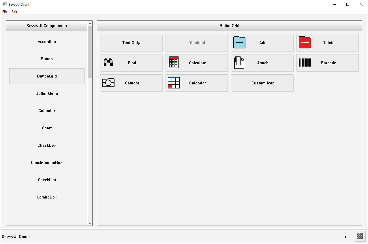
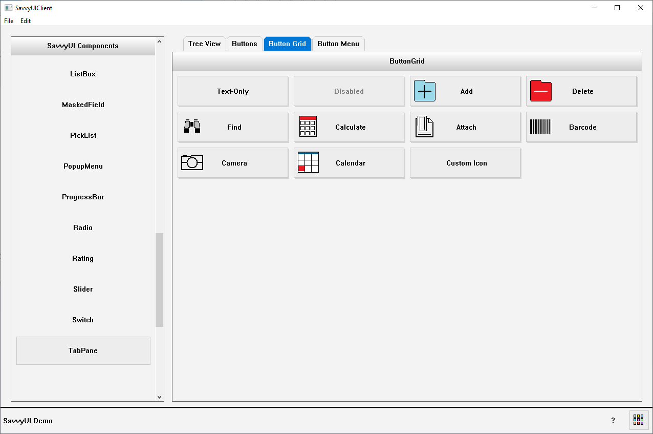
Button Grid Component
A **button grid** is a layout component that arranges multiple button elements in a structured, grid-based format. This design pattern is commonly used to display a set of related actions, options, or tools in a visually organized and easily navigable way. Button grids are especially useful in interfaces where users need to make selections quickly or perform tasks from a predefined set—such as in keypads, dashboards, filter menus, or control panels. The grid layout can be responsive, adapting the number of columns and rows based on screen size or container width. Button grids improve usability by grouping actions clearly, reducing cognitive load, and enabling efficient interaction across both desktop and mobile environments.
class ButtonGridDemo: public GridPanel, public ActionListener
{
	ButtonGrid _buttonGrid;

public:

	ButtonGridDemo()
	{
		_buttonGrid.setTitle(L"ButtonGrid");
		_buttonGrid.addActionListener(this);
		_buttonGrid.addButton(L"Text-Only");
		_buttonGrid.addButton(L"Disabled");
		_buttonGrid.enableButton(L"Disabled", FALSE);
		_buttonGrid.addButton(L"Add", IconSource(IconType::ADD));
		_buttonGrid.addButton(L"Delete", IconSource(IconType::REMOVE));
		_buttonGrid.addButton(L"Find", IconSource(IconType::BINOCULAR));
		_buttonGrid.addButton(L"Calculate", IconSource(IconType::CALCULATOR));
		_buttonGrid.addButton(L"Attach", IconSource(IconType::ATTACH));
		_buttonGrid.addButton(L"Barcode", IconSource(IconType::BARCODE));
		_buttonGrid.addButton(L"Camera", IconSource(IconType::CAMERA));
		_buttonGrid.addButton(L"Calendar", IconSource(IconType::CALENDAR));
		_buttonGrid.addButton(L"Custom Icon", IconSource(L"deliveryorder.gif"));

		setMargin(0);
		setLayout({ -1 }, { -1 });
		addComponent(&_buttonGrid, 0, 0);
	}
	~ButtonGridDemo(){}

public:

	void onAction(const ActionEvent& ev)
	{
		DialogFactory::showInfo(this, ev.actionName, L"Button Clicked");
	}
};
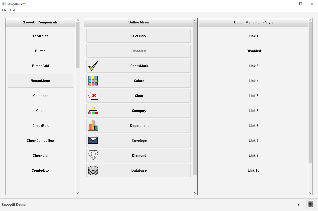
Button Menu Component
A **button menu with text and images** is a user interface component that presents a collection of clickable buttons, each combining an icon or image with a descriptive text label. This design enhances both visual appeal and usability by leveraging imagery to quickly communicate the function or category of each button, while the accompanying text provides clarity and context. Commonly used in navigation menus, dashboards, mobile apps, and feature selectors, this type of menu allows users to easily identify and interact with available options. The layout is presented as a list, and may include hover or active states, making it intuitive and engaging across devices. Ideal for visually-driven interfaces, this component supports accessibility and reinforces recognition over recall, improving overall user experience.
class ButtonMenuDemo : public GridPanel, public SelectionChangeListener
{
	ButtonMenu _buttonMenu1;
	ButtonMenu _buttonMenu2;

public:

	ButtonMenuDemo()
	{
		_buttonMenu1.setTitle(L"Button Menu");
		_buttonMenu1.addSelectionChangedListener(this);
		_buttonMenu1.addItem(L"Text-Only");
		_buttonMenu1.addItem(L"Disabled");
		_buttonMenu1.enableItem(L"Disabled", FALSE);
		_buttonMenu1.addItem(L"CheckMark", L"", IconSource(IconType::CHECKMARK));
		_buttonMenu1.addItem(L"Colors", L"", IconSource(IconType::COLORS));
		_buttonMenu1.addItem(L"Clear", L"", IconSource(IconType::CLEAR));
		_buttonMenu1.addItem(L"Category", L"", IconSource(IconType::CATEGORY));
		_buttonMenu1.addItem(L"Department", L"", IconSource(IconType::DEPARTMENT));
		_buttonMenu1.addItem(L"Envelope", L"", IconSource(IconType::ENVELOPE));
		_buttonMenu1.addItem(L"Diamond", L"", IconSource(IconType::DIAMONDKARAT));
		_buttonMenu1.addItem(L"Database", L"", IconSource(IconType::DATABASE));
		_buttonMenu1.addItem(L"Custom Icon", L"", IconSource(L"deliveryorder.gif"));

		_buttonMenu2.setTitle(L"Button Menu - Link Style");
		_buttonMenu2.enableLinkStyle();
		_buttonMenu2.addSelectionChangedListener(this);
		_buttonMenu2.addItem(L"Link 1");
		_buttonMenu2.addItem(L"Disabled");
		_buttonMenu2.addItem(L"Link 3");
		_buttonMenu2.enableItem(L"Disabled", FALSE);
		_buttonMenu2.addItem(L"Link 4", L"");
		_buttonMenu2.addItem(L"Link 5", L"");
		_buttonMenu2.addItem(L"Link 6", L"");
		_buttonMenu2.addItem(L"Link 7", L"");
		_buttonMenu2.addItem(L"Link 8", L"");
		_buttonMenu2.addItem(L"Link 9", L"");
		_buttonMenu2.addItem(L"Link 10", L"");
		_buttonMenu2.addItem(L"Link 11", L"");
		_buttonMenu2.addItem(L"Link 12", L"");

		setMargin(0);
		setLayout({ -1, -1 }, { -1 });
		addComponent(&_buttonMenu1, 0, 0);
		addComponent(&_buttonMenu2, 1, 0);
	}
	~ButtonMenuDemo(){}

public:

	void onSelectionChanged(const SelectionChangeEvent& ev)
	{
		DialogFactory::showInfo(this, ev.selectionValue, L"Item Selected");
	}
};
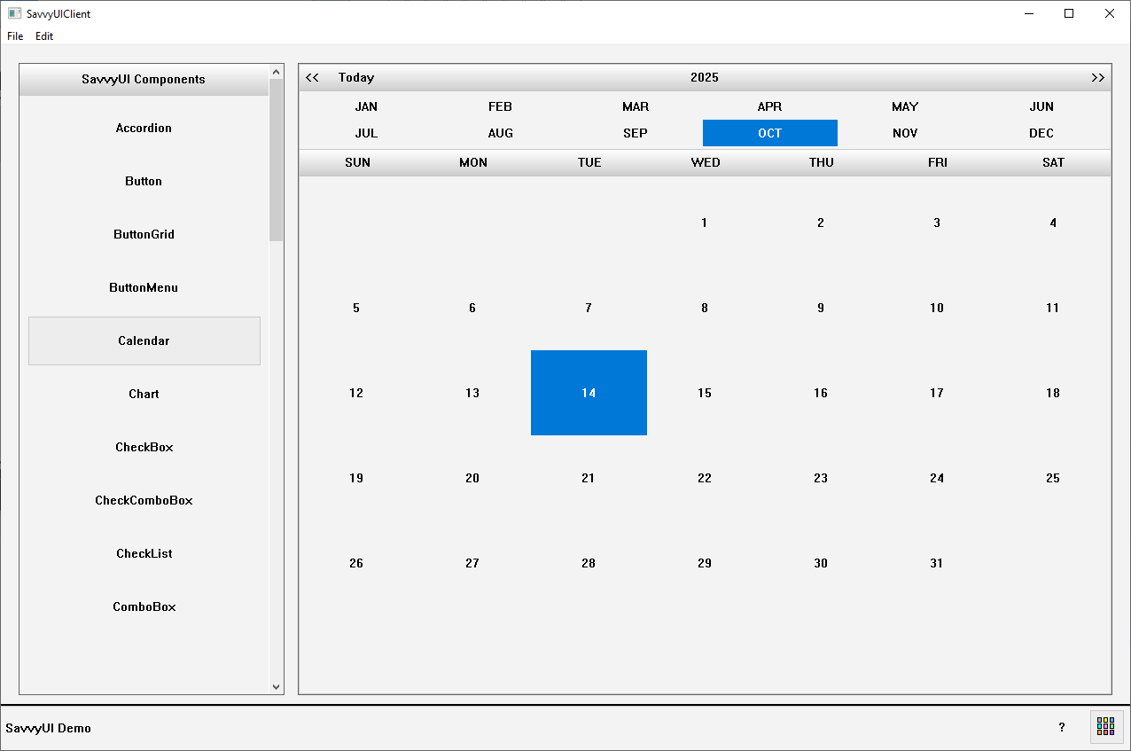
Calendar Component
A **dates calendar** component is a simple and focused UI element that displays the days of a selected month in a grid format, primarily used for date viewing or selection rather than event scheduling. It typically includes navigation controls to move between months and years, and allows users to select a single date or a date range. This type of calendar is commonly used in forms, booking interfaces, or filters where users need to pick a specific date without the complexity of managing events or tasks. Clean and minimal by design, a dates calendar emphasizes usability and clarity, making it easy to browse and choose dates across different devices and screen sizes.
class CalendarDemo : public GridPanel, public SelectionChangeListener
{
	Calendar _calendar;

public:

	CalendarDemo()
	{
		_calendar.addSelectionChangedListener(this);

		setMargin(0);
		setLayout({ -1 }, { -1 });
		addComponent(&_calendar, 0, 0);
	}
	~CalendarDemo(){}

public:

	void onSelectionChanged(const SelectionChangeEvent& ev)
	{
		DialogFactory::showInfo(getWindowHandle(), ev.selectionValue, L"Date Selected");
	}
};
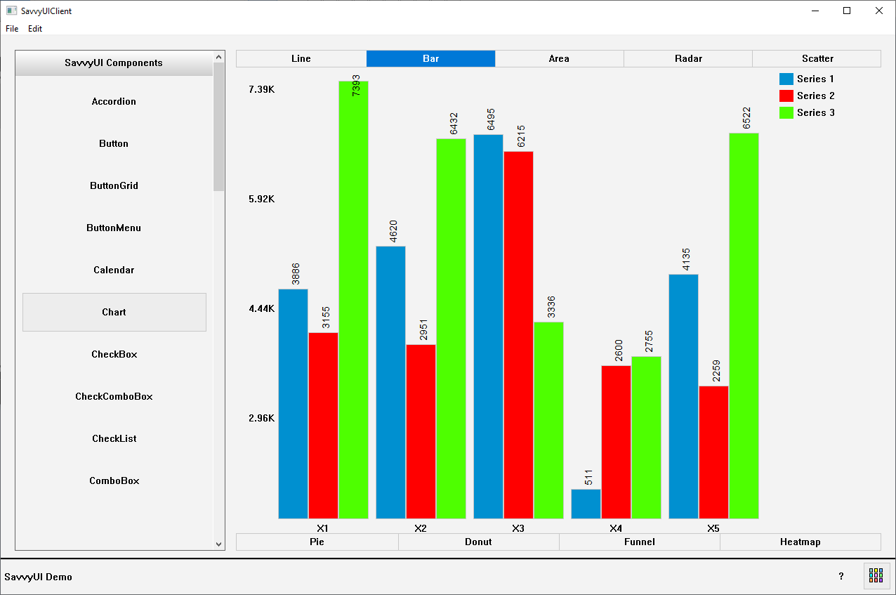
Chart Component
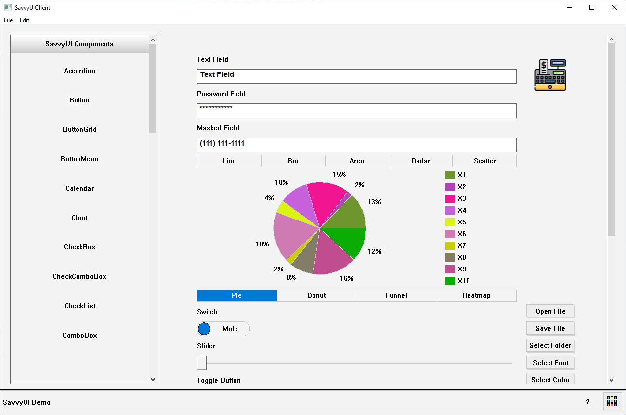
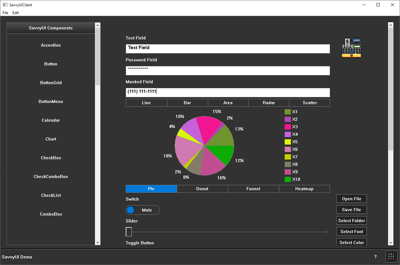
A **charts component** is a visual interface element used to represent data graphically, making complex information easier to understand and analyze at a glance. Common chart types include bar charts, line charts, pie charts, area charts, and scatter plots, each suited for different kinds of data relationships and comparisons. Charts components are often interactive, allowing features like tooltips, legends, filtering, and zooming to enhance user engagement and insight. They are widely used in dashboards, reports, analytics tools, and data-driven applications to highlight trends, distributions, and patterns. Designed with responsiveness and customization in mind, a charts component can adapt to various data sets and screen sizes, delivering a clear and intuitive visual experience.
class ChartDemo : public GridPanel, public SelectionChangeListener
{
	Chart _chart;

public:

	ChartDemo()
	{
		_chart.setType(ChartType::BAR);
		_chart.showTypeToggleButtons(TRUE);
		_chart.setCategories({ L"X1", L"X2", L"X3", L"X4", L"X5", L"X6" });
		_chart.addSeries(L"Series 1", RGB(0, 144, 208));
		_chart.addSeries(L"Series 2", RGB(255, 0, 0));
		_chart.addSeries(L"Series 3", RGB(78, 255, 0));
		// Generate random data
		std::random_device rd;                         // Seed source
		std::mt19937 gen(rd());                        // Mersenne Twister engine
		std::uniform_real_distribution dis(0.0f, 10000.0f); // Range: [0.0, 10000.0)
		for (int s = 0; s < 5; s++)
		{
			_chart.addSeriesValue(L"Series 1", dis(gen), RGB(((int)dis(gen)) % 255, ((int)dis(gen)) % 255, ((int)dis(gen)) % 255));
			_chart.addSeriesValue(L"Series 2", dis(gen), RGB(((int)dis(gen)) % 255, ((int)dis(gen)) % 255, ((int)dis(gen)) % 255));
			_chart.addSeriesValue(L"Series 3", dis(gen), RGB(((int)dis(gen)) % 255, ((int)dis(gen)) % 255, ((int)dis(gen)) % 255));
		}

		setMargin(0);
		setLayout({ -1 }, { -1 });
		addComponent(&_chart, 0, 0);
	}
	~ChartDemo() {}

public:

	void onSelectionChanged(const SelectionChangeEvent& ev)
	{
	}
};
CheckList Component
A **checklist** is a user interface component that displays a list of items, each accompanied by a checkbox, allowing users to mark tasks or options as completed or selected. This component is commonly used for task management, to-do lists, settings configuration, or multi-option selection. Users can check or uncheck each item independently, and the state of each checkbox provides a clear visual indication of progress or selection. Checklists help organize information in a simple, linear format that encourages interaction and improves clarity. They are often enhanced with features like labels, descriptions, grouping, or drag-and-drop reordering. Easy to use and highly intuitive, the checklist is a practical component for both productivity and selection interfaces.

class CheckListDemo : public GridPanel, public SelectionChangeListener
{
	CheckList _checkList;

public:

	CheckListDemo()
	{
		_checkList.setOptions({ {L"CA", L"California"}, {L"FL", L"Florida"} });

		setLayout({ -1 }, { -1 });
		addComponent(&_checkList, 0, 0);
	}
	~CheckListDemo(){}

public:

	void onSelectionChanged(const SelectionChangeEvent& ev)
	{
		DialogFactory::showInfo(this, ev.selectionValue, L"CheckList Selection Change");
	}
};
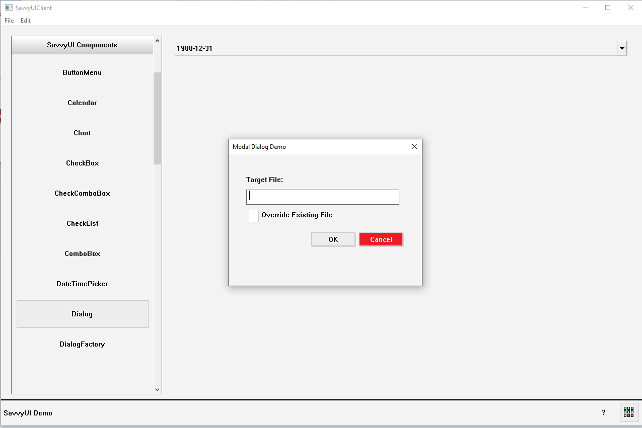
Modal Dialog
A **modal dialog** is a UI component that appears as a pop-up window overlaying the main content, requiring the user to interact with it before returning to the underlying interface. It is commonly used to capture user attention for important tasks such as confirming actions, displaying alerts, gathering input, or presenting critical information without navigating away from the current page. Modal dialogs typically include a header, body content, and action buttons (e.g., “Confirm” and “Cancel”). They disable interaction with the background content to focus user engagement and prevent accidental clicks outside the dialog. Well-designed modal dialogs support accessibility features like keyboard navigation and screen reader compatibility, ensuring they are usable by all users.
#include <include/Label.h>
#include <include/TextField.h>
#include <include/MaskedField.h>
#include <include/Button.h>
#include <include/DialogFactory.h>

class DialogDemo : public Dialog, public ActionListener
{
	Label _firstNameLabel, _lastNameLabel, _telephoneLabel;
	TextField _firstnameField, _lastNameField;
	MaskedField _telephoneField;

	Button _okButton, _cancelButton;

public:

	wstring _firstName, _lastName, _telephone;

public:

	DialogDemo()
	{
	}

	~DialogDemo()
	{
	}

	BOOL windowOpening()
	{
		setTitle(L"Employee Details");
		setSize(400, 350);

		GridPanel* contentPane = getContentPane();
		if (contentPane != NULL)
		{
			_okButton.setText(L"OK");
			_okButton.addActionListener(this);
			_cancelButton.setText(L"Cancel");
			_cancelButton.setButtonType(ButtonType::DANGER);
			_cancelButton.addActionListener(this);

			_firstNameLabel.setText(L"First Name:");
			_lastNameLabel.setText(L"Last Name:");
			_telephoneLabel.setText(L"Telephone:");

			_telephoneField.setmask(L"+1 (###) ###-####");

			// Initialize the fields values
			_firstNameField.setText(_firstName);
			_lastNameField.setText(_lastName);
			_telephoneField.setText(_telephone);

			contentPane->setLayout({ -1, 100, 100 }, { 30, 30, 30, 30, 30, 30, 10, 30 });
			contentPane->addComponent(&_firstNameLabel, 0,0,3); // spans 3 columns
			contentPane->addComponent(&_firstNameField, 0,1,3); // spans 3 columns
			contentPane->addComponent(&_lastNameLabel, 0,2,3); // spans 3 columns
			contentPane->addComponent(&_lastNameField, 0,3,3); // spans 3 columns
			contentPane->addComponent(&_telephoneLabel, 0,4,3); // spans 3 columns
			contentPane->addComponent(&_telephoneField, 0,5,3); // spans 3 columns
			contentPane->addComponent(&_okButton, 1, 7);
			contentPane->addComponent(&_cancelButton, 2, 7);
		}
		return TRUE;
	}

	BOOL windowOpened()
	{
		return TRUE;
	}

	BOOL okToClose()
	{
		return TRUE;
	}

	void windowClosed()
	{
	}

	void onAction(const ActionEvent& ev)
	{
		if (ev.sourceComponentId == _okButton.getId())
		{
			_firstName = _firstNameField.getText();
			_lastName = _lastNameField.getText();
			_telephone = _telephoneField.getText();
			if(_firstName.length() == 0 || _lastName.length() == 0)
			{
				DialogFactory::showWarning(this, L"Both first and last name are required.");
				return;
			}
			close(DIALOG_OK);
		}
		else if (ev.sourceComponentId == _cancelButton.getId())
		{
			close(DIALOG_CANCEL);
		}
	}
};

// USAGE Example:
DialogDemo dlg;
dlg._firstName = L"John";
dlg._lastName = L"Doe";
dlg._telephone = L"+1 (000) 000-0000";
dlg.show(this);
if(dlg.getExitCode() == DIALOG_OK)
{
	// Save entered information: dlg._firstName, dlg._lastName, dlg._telephone
}
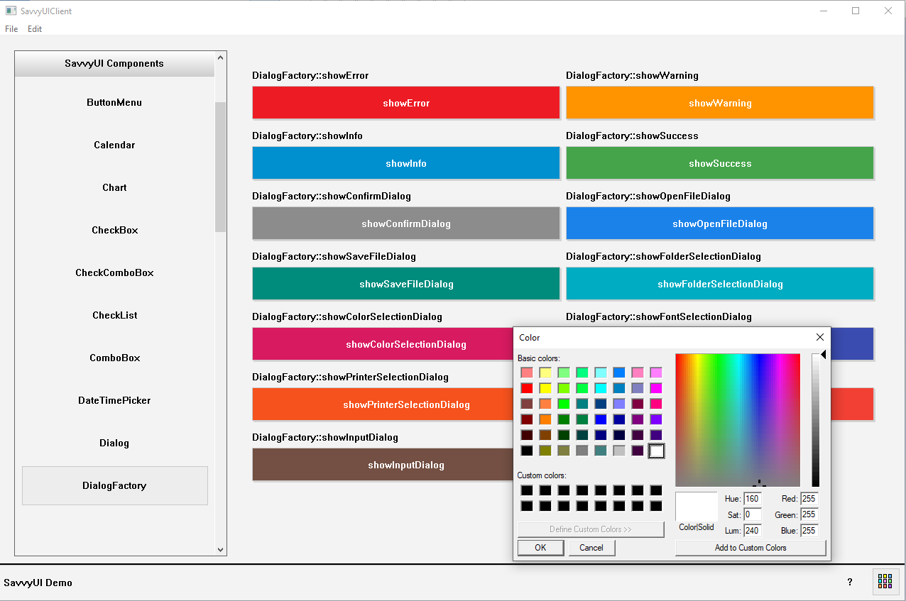
DialogFactory
A **DialogFactory** is a design pattern or utility component in software development that simplifies the creation and management of dialog components (such as modals, alerts, confirmation dialogs, or input forms) by providing a centralized, reusable way to generate dialogs with consistent styling and behavior. Instead of manually building each dialog from scratch, a DialogFactory abstracts the common setup—like layout, buttons, event handling, and accessibility features—allowing developers to quickly create customized dialogs by specifying only the unique content and actions. This approach promotes code reuse, consistency across the application, and easier maintenance.
class DialogFactoryDemo : public /*GridPanel*/FluidPanel, public ActionListener
{
	Component* _parent;

	Button _buttonError;
	Button _buttonWarning;
	Button _buttonInfo;
	Button _buttonSuccess;
	Button _buttonConfirm;
	Button _buttonOpenFile;
	Button _buttonSaveFile;
	Button _buttonSelectFolder;
	Button _buttonSelectColor;
	Button _buttonSelectFont;
	Button _buttonSelectPrinter;
	Button _buttonPrinterSetup;
	Button _buttonInputDialog;

public:

	DialogFactoryDemo()
	{
		_parent = NULL;

		_buttonError.setButtonType(ButtonType::DANGER);
		_buttonError.setText(L"showError");
		_buttonError.addActionListener(this);
		_buttonWarning.setButtonType(ButtonType::WARN);
		_buttonWarning.setText(L"showWarning");
		_buttonWarning.addActionListener(this);
		_buttonInfo.setButtonType(ButtonType::INFO);
		_buttonInfo.setText(L"showInfo");
		_buttonInfo.addActionListener(this);
		_buttonSuccess.setButtonType(ButtonType::SUCCESS);
		_buttonSuccess.setText(L"showSuccess");
		_buttonSuccess.addActionListener(this);
		_buttonConfirm.setButtonType(ButtonType::GRAY);
		_buttonConfirm.setText(L"showConfirmDialog");
		_buttonConfirm.addActionListener(this);
		_buttonOpenFile.setButtonType(ButtonType::BLUE);
		_buttonOpenFile.setText(L"showOpenFileDialog");
		_buttonOpenFile.addActionListener(this);
		_buttonSaveFile.setButtonType(ButtonType::TEAL);
		_buttonSaveFile.setText(L"showSaveFileDialog");
		_buttonSaveFile.addActionListener(this);
		_buttonSelectFolder.setButtonType(ButtonType::CYAN);
		_buttonSelectFolder.setText(L"showFolderSelectionDialog");
		_buttonSelectFolder.addActionListener(this);
		_buttonSelectColor.setButtonType(ButtonType::PINK);
		_buttonSelectColor.setText(L"showColorSelectionDialog");
		_buttonSelectColor.addActionListener(this);
		_buttonSelectFont.setButtonType(ButtonType::INDIGO);
		_buttonSelectFont.setText(L"showFontSelectionDialog");
		_buttonSelectFont.addActionListener(this);
		_buttonSelectPrinter.setButtonType(ButtonType::ORANGE);
		_buttonSelectPrinter.setText(L"showPrinterSelectionDialog");
		_buttonSelectPrinter.addActionListener(this);
		_buttonPrinterSetup.setButtonType(ButtonType::RED);
		_buttonPrinterSetup.setText(L"showPrinterSetupDialog");
		_buttonPrinterSetup.addActionListener(this);
		_buttonInputDialog.setButtonType(ButtonType::BROWN);
		_buttonInputDialog.setText(L"showInputDialog");
		_buttonInputDialog.addActionListener(this);

		setMinColumnWidth(320);
		setFieldHeight(50);
		addComponent(&_buttonError, L"DialogFactory::showError");
		addComponent(&_buttonWarning, L"DialogFactory::showWarning");
		addComponent(&_buttonInfo, L"DialogFactory::showInfo");
		addComponent(&_buttonSuccess, L"DialogFactory::showSuccess");
		addComponent(&_buttonConfirm, L"DialogFactory::showConfirmDialog");
		addComponent(&_buttonOpenFile, L"DialogFactory::showOpenFileDialog");
		addComponent(&_buttonSaveFile, L"DialogFactory::showSaveFileDialog");
		addComponent(&_buttonSelectFolder, L"DialogFactory::showFolderSelectionDialog");
		addComponent(&_buttonSelectColor, L"DialogFactory::showColorSelectionDialog");
		addComponent(&_buttonSelectFont, L"DialogFactory::showFontSelectionDialog");
		addComponent(&_buttonSelectPrinter, L"DialogFactory::showPrinterSelectionDialog");
		addComponent(&_buttonPrinterSetup, L"DialogFactory::showPrinterSetupDialog");
		addComponent(&_buttonInputDialog, L"DialogFactory::showInputDialog");
	}

	~DialogFactoryDemo()
	{
	}

	void setParent(Component* parent)
	{
		_parent = parent;
	}

	void onAction(const ActionEvent& ev)
	{
		wstring selection;
		COLORREF selectedColor;
		long fontHeight;
		long fontWeight;
		BOOL isItalic;
		long leftMargin, topMargin, rightMargin, bottomMargin;
		vector values;

		if(ev.actionName == L"showError")
			DialogFactory::showError(_parent, L"DialogFactory::"+ev.actionName+L"()", L"Error Dialog");
		else if (ev.actionName == L"showWarning")
			DialogFactory::showWarning(_parent, L"DialogFactory::" + ev.actionName + L"()", L"Warning Dialog");
		else if (ev.actionName == L"showInfo")
			DialogFactory::showInfo(_parent, L"DialogFactory::" + ev.actionName + L"()", L"Info Dialog");
		else if (ev.actionName == L"showSuccess")
			DialogFactory::showSuccess(_parent, L"DialogFactory::" + ev.actionName + L"()", L"Success Dialog");
		else if (ev.actionName == L"showConfirmDialog")
			DialogFactory::showConfirmDialog(_parent, L"DialogFactory::" + ev.actionName + L"()", L"Confirm Dialog");
		else if (ev.actionName == L"showOpenFileDialog")
			DialogFactory::showOpenFileDialog(_parent, selection);
		else if (ev.actionName == L"showSaveFileDialog")
			DialogFactory::showSaveFileDialog(_parent, selection);
		else if (ev.actionName == L"showFolderSelectionDialog")
			DialogFactory::showFolderSelectionDialog(_parent, selection);
		else if (ev.actionName == L"showColorSelectionDialog")
			DialogFactory::showColorSelectionDialog(_parent, selectedColor);
		else if (ev.actionName == L"showFontSelectionDialog")
			DialogFactory::showFontSelectionDialog(_parent, selection, fontHeight, fontWeight, isItalic, selectedColor);
		else if (ev.actionName == L"showPrinterSelectionDialog")
			DialogFactory::showPrinterSelectionDialog(_parent);
		else if (ev.actionName == L"showPrinterSetupDialog")
			DialogFactory::showPrinterSetupDialog(_parent, leftMargin, topMargin, rightMargin, bottomMargin);
		else if (ev.actionName == L"showInputDialog")
			DialogFactory::showInputDialog(_parent, { L"Name:", L"Address",L"City", L"State",L"Zipcode" }, values);
	}
};
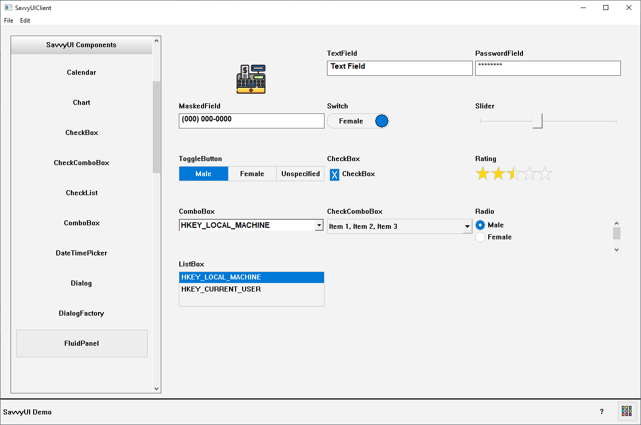
FluidPanel Component
The FluidPanel is a layout management component that can be used to display components from left-to-right, with the responsive capability built-in, you simply set the minimum width of a column, and the component takes care of laying out the child components in a responsive manner.
class FluidPanelDemo : public FluidPanel
{
	Image _image;
	TextField _textField;
	TextField _passwordField;
	MaskedField _maskedField;
	ToggleButton _toggleButton;
	Switch _switch;
	Slider _slider;
	ComboBox _comboField;
	CheckComboBox _checkComboField;
	Radio _radioField;
	ListBox _listboxField;
	CheckBox _checkBox;
	Rating _rating;

public:

	FluidPanelDemo()
	{
		setMinColumnWidth(250);
		setFieldHeight(70);

		_image.setImage(L"c:\\ezpointofsale\\images\\closeshift.gif");
		_image.setAlignment(ImageAlignment::MIDDLECENTER);
		addComponent(&_image, L"");
		addComponent(&_textField, L"TextField");
		_passwordField.setPassword(TRUE);
		addComponent(&_passwordField, L"PasswordField");
		_maskedField.setMask(L"(###) ###-####");// L"(###) ###-####");
		addComponent(&_maskedField, L"MaskedField");

		_switch.setOptions(L"Male", L"Female");
		addComponent(&_switch, L"Switch");
		addComponent(&_slider, L"Slider");
		_toggleButton.setOptions({ L"Male", L"Female", L"Unspecified" });
		addComponent(&_toggleButton, L"ToggleButton");
		_checkBox.setText(L"CheckBox");
		addComponent(&_checkBox, L"CheckBox");
		addComponent(&_rating, L"Rating");
		_comboField.setOptions({ L"HKEY_LOCAL_MACHINE",L"HKEY_CURRENT_USER" });
		addComponent(&_comboField, L"ComboBox");
		vector selections;
		for (int i = 1; i < 100; i++)
		{
			wchar_t actionId[50];
			_itow_s(i, actionId, 49, 10);
			selections.push_back(KeyValue(actionId, wstring(L"Item ") + actionId));
		}
		_checkComboField.setOptions(selections);
		addComponent(&_checkComboField, L"CheckComboBox");
		_radioField.setOrientation(L"VERT");
		_radioField.addOption(L"M", L"Male");
		_radioField.addOption(L"F", L"Female");
		_radioField.addOption(L"U", L"Unknown");
		addComponent(&_radioField, L"Radio");
		_listboxField.addItem(L"HKEY_LOCAL_MACHINE");
		_listboxField.addItem(L"HKEY_CURRENT_USER");
		addComponent(&_listboxField, L"ListBox");
	}
	~FluidPanelDemo(){}
};
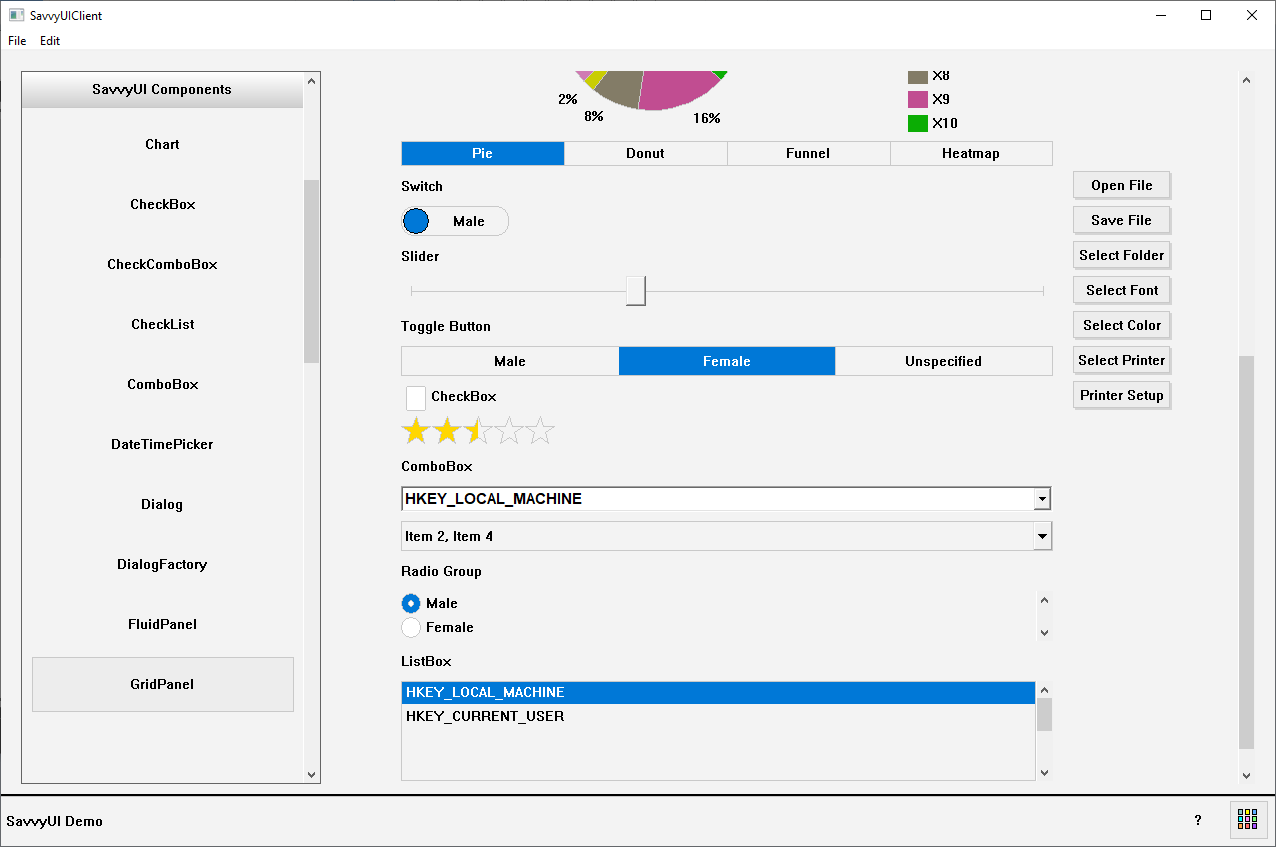
GridPanel Component
A **responsive container panel** is a versatile UI component designed to automatically adjust its size, layout, and content arrangement based on the screen size or device viewport. It acts as a flexible wrapper or section that can contain other elements—such as text, images, or controls—and ensures they are displayed optimally on desktops, tablets, and mobile devices. Responsive container panels use fluid grids, flexible widths, and media queries (in web design) or adaptive layout techniques to reorganize content, resize components, and maintain usability across different screen dimensions. They are essential for building modern, mobile-friendly interfaces that provide a consistent and user-friendly experience regardless of how users access the application or website.
class GridPanelDemo : public GridPanel, public ActionListener
{
	Image _image;
	Label _textFieldLabel;
	TextField _textField;
	Label _passwordFieldLabel;
	TextField _passwordField;
	Label _maskedFieldLabel;
	MaskedField _maskedField;
	Label _toggleButtonLabel;
	ToggleButton _toggleButton;
	Label _switchLabel;
	Switch _switch;
	Label _sliderLabel;
	Slider _slider;
	Label _comboFieldLabel;
	ComboBox _comboField;
	CheckComboBox _checkComboField;
	Label _radioFieldLabel;
	Radio _radioField;
	Label _listboxFieldLabel;
	ListBox _listboxField;
	CheckBox _checkBox;
	Rating _rating;
	Chart _chart;
	Button _openFileDialog, _saveFileDialog, _selectFolderDialog, _selectFontDialog, _selectColorDialog, _selectPrinterDialog, _pageSetupDialog;

public:

	GridPanelDemo()
	{
		setLayout({ -1 , 10, 100 }, {30, 30,30,30,30,30,30,300,30,30,30,30,30,30,30,30,30,30, 80, 30, 50, 30, 100 });

		addComponent(&_image, 2, 0, 1, 3); // Place image at column 2, row 0, and make it span 3 rows

		addComponent(&_textFieldLabel, 0, 1); // Place component at column 0, row 1
		addComponent(&_textField, 0,2); // Place component at column 0, row 2
		addComponent(&_passwordFieldLabel, 0,3);
		addComponent(&_passwordField, 0,4);
		addComponent(&_maskedFieldLabel, 0,5);
		addComponent(&_maskedField, 0,6);
		addComponent(&_chart, 0, 7);
		addComponent(&_switchLabel, 0, 8);
		addComponent(&_switch, 0,9);
		addComponent(&_sliderLabel, 0, 10);
		addComponent(&_slider, 0, 11);
		addComponent(&_toggleButtonLabel, 0, 12);
		addComponent(&_toggleButton, 0, 13);
		addComponent(&_checkBox, 0,14);
		addComponent(&_rating, 0, 15);
		addComponent(&_comboFieldLabel, 0,16);
		addComponent(&_comboField, 0, 17);
		addComponent(&_checkComboField, 0, 18);
		addComponent(&_radioFieldLabel, 0, 19);
		addComponent(&_radioField, 0,20);
		addComponent(&_listboxFieldLabel, 0, 21);
		addComponent(&_listboxField, 0, 22);

		addComponent(&_openFileDialog, 3, 8); // Place component at column 3, row 8
		addComponent(&_saveFileDialog, 3, 9); // Place component at column 3, row 9
		addComponent(&_selectFolderDialog, 3, 10);
		addComponent(&_selectFontDialog, 3, 11);
		addComponent(&_selectColorDialog, 3, 12);
		addComponent(&_selectPrinterDialog, 3, 13);
		addComponent(&_pageSetupDialog, 3, 14);

		initComponents();
	}

	~GridPanelDemo()
	{
	}

	void initComponents()
	{
		_image.setImage(L"c:\\ezpointofsale\\images\\closeshift.gif");
		_image.setAlignment(ImageAlignment::MIDDLECENTER);
		_textFieldLabel.setText(L"Text Field");
		_passwordFieldLabel.setText(L"Password Field");
		_passwordField.setPassword(TRUE);

		_maskedFieldLabel.setText(L"Masked Field");
		_maskedField.setMask(L"(###) ###-####");// L"(###) ###-####");

		_chart.setType(ChartType::PIE);
		_chart.showTypeToggleButtons(TRUE);
		_chart.setCategories({ L"X1", L"X2", L"X3", L"X4", L"X5", L"X6", L"X7", L"X8", L"X9", L"X10" });
		_chart.addSeries(L"Series 1", RGB(0, 0, 200));
		_chart.addSeries(L"Series 2", RGB(255, 0, 0));
		_chart.addSeries(L"Series 3", RGB(0, 128, 0));
		// Generate random data
		std::random_device rd;                         // Seed source
		std::mt19937 gen(rd());                        // Mersenne Twister engine
		std::uniform_real_distribution dis(0.0f, 10000.0f); // Range: [0.0, 10000.0)
		for (int s = 0; s < 10; s++)
		{
			_chart.addSeriesValue(L"Series 1", dis(gen), RGB(((int)dis(gen)) % 255, ((int)dis(gen)) % 255, ((int)dis(gen)) % 255));
			_chart.addSeriesValue(L"Series 2", dis(gen), RGB(((int)dis(gen)) % 255, ((int)dis(gen)) % 255, ((int)dis(gen)) % 255));
			_chart.addSeriesValue(L"Series 3", dis(gen), RGB(((int)dis(gen)) % 255, ((int)dis(gen)) % 255, ((int)dis(gen)) % 255));
		}

		_switchLabel.setText(L"Switch");
		_switch.setOptions(L"Male", L"Female");

		_sliderLabel.setText(L"Slider");

		_toggleButtonLabel.setText(L"Toggle Button");
		_toggleButton.setOptions({ L"Male", L"Female", L"Unspecified" });

		_checkBox.setText(L"CheckBox");

		_comboFieldLabel.setText(L"ComboBox");
		_comboField.setOptions({ L"HKEY_LOCAL_MACHINE",L"HKEY_CURRENT_USER" });

		vector selections;
		for (int i = 1; i < 100; i++)
		{
			wchar_t actionId[50];
			_itow_s(i, actionId, 49, 10);
			selections.push_back(KeyValue(actionId, wstring(L"Item ") + actionId));
		}
		_checkComboField.setOptions(selections);

		_radioFieldLabel.setText(L"Radio Group");
		_radioField.setOrientation(L"VERT");
		_radioField.addOption(L"M", L"Male");
		_radioField.addOption(L"F", L"Female");
		_radioField.addOption(L"U", L"Unknown");

		_listboxFieldLabel.setText(L"ListBox");
		_comboField.setOptions({ L"HKEY_LOCAL_MACHINE",L"HKEY_CURRENT_USER" });
		_listboxField.addItem(L"HKEY_LOCAL_MACHINE");
		_listboxField.addItem(L"HKEY_CURRENT_USER");

		_openFileDialog.setText(L"Open File");
		_openFileDialog.addActionListener(this);
		_saveFileDialog.setText(L"Save File");
		_selectFolderDialog.setText(L"Select Folder");
		_selectFontDialog.setText(L"Select Font");
		_selectColorDialog.setText(L"Select Color");
		_selectPrinterDialog.setText(L"Select Printer");
		_pageSetupDialog.setText(L"Printer Setup");
	}

	void onAction(const ActionEvent& ev)
	{
		wstring selection;
		if (ev.actionName == L"Open File")
			DialogFactory::showOpenFileDialog(this, selection);
	}
};
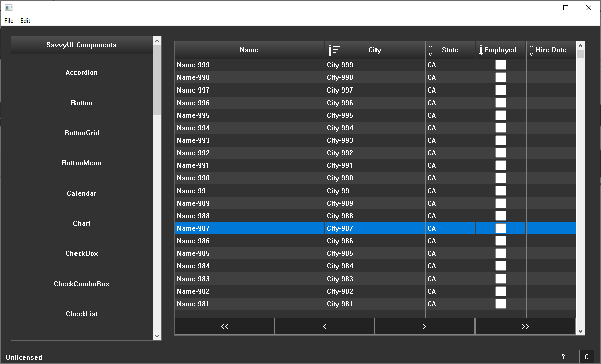
Grid Component
The grid component is a table component that displays rows of data, you can configure the columns, their width, their editable state, etc. You can also enable paging by implementing a paging interface, and then you implement a function that the grid will call each time it needs to fetch a page.
class GridDemoData
{
public:
	wstring name;
	double regularhours;
	double regularrate;
	double overtimehours;
	double overtimerate;
	double taxrate;
};
class GridDemo : public GridPanel, public Pager, public GridChangeListener
{
	Grid _grid;
	vector< GridDemoData> _data;

public:

	GridDemo()
	{
		_grid.addColumn(L"Name", L"Name", TRUE, 30, -1, FALSE, FALSE, TRUE);
		_grid.addColumn(L"RegularHours", L"Regular Hours", TRUE, 10, 1, TRUE, FALSE, TRUE);
		_grid.addColumn(L"RegularRate", L"Regular Rate", TRUE, 10, 1, TRUE, FALSE, TRUE);
		_grid.addColumn(L"OvertimeHours", L"Overtime Hours", TRUE, 10, 1, TRUE, FALSE, TRUE);
		_grid.addColumn(L"OvertimeRate", L"Overtime Rate", TRUE, 10, 1, TRUE, FALSE, TRUE);
		_grid.addColumn(L"TaxRate", L"Tax Rate", TRUE, 10, 1, TRUE, FALSE, TRUE);
		_grid.addColumn(L"GrossPay", L"Gross Pay", TRUE, 10, 1, TRUE, FALSE, FALSE, EditType::COMPUTED, {}, L"regularhours*regularrate + overtimehours*overtimerate");
		_grid.addColumn(L"NetPay", L"Net Pay", TRUE, 10, 1, TRUE, FALSE, FALSE, EditType::COMPUTED, {}, L"(regularhours*regularrate + overtimehours*overtimerate) - (regularhours*regularrate + overtimehours*overtimerate)*taxrate / 100.0");
		_grid.setPager(this);
		_grid.addGridChangeListener(this);

		setLayout({ -1 }, { -1 });
		addComponent(&_grid, 0, 0);

		// Load sample data
		for (__int64 row = 0; row < 1000; row++)
		{
			GridDemoData newRow;
			wchar_t sNo[50];
			_itow_s(row + 1, sNo, 49, 10);
			newRow.name = wstring(L"Name-") + sNo;
			newRow.regularhours = 40;
			newRow.regularrate = (row%2) == 0 ? 20: 10;
			newRow.overtimehours = (row % 2) == 0 ? 0 : 2;
			newRow.overtimerate = (row % 2) == 0 ? 30 : 25;
			newRow.taxrate = 25;

			_data.push_back(newRow);
		}
	}

	~GridDemo()
	{
	}

	BOOL GetPage(const PagerRequest& request, const vector& columnNames, vector>& rows, __int64& totalRowCount)
	{
		if (request.startRowIndex >= 0 && request.startRowIndex < _data.size())
		{
			/*
			if (request.sortBy.length() > 0)
			{
				if (request.sortBy == L"Name") {
					if (request.sortDirection == SortType::DESCENDING) {
						std::sort(_data.begin(), _data.end(), [](const GridDemoData& a, const GridDemoData& b) {
							return a.name > b.name;
							});
					}
					else {
						std::sort(_data.begin(), _data.end(), [](const GridDemoData& a, const GridDemoData& b) {
							return a.name < b.name;
							});
					}
				} else if (request.sortBy == L"City") {
					if (request.sortDirection == SortType::DESCENDING) {
						std::sort(_data.begin(), _data.end(), [](const GridDemoData& a, const GridDemoData& b) {
							return a.city > b.city;
							});
					}
					else {
						std::sort(_data.begin(), _data.end(), [](const GridDemoData& a, const GridDemoData& b) {
							return a.city < b.city;
							});
					}
				}
				else if (request.sortBy == L"State") {
					if (request.sortDirection == SortType::DESCENDING) {
						std::sort(_data.begin(), _data.end(), [](const GridDemoData& a, const GridDemoData& b) {
							return a.state > b.state;
						});
					}
					else {
						std::sort(_data.begin(), _data.end(), [](const GridDemoData& a, const GridDemoData& b) {
							return a.state < b.state;
							});
					}
				}
				else if (request.sortBy == L"Employed") {
					if (request.sortDirection == SortType::DESCENDING) {
						std::sort(_data.begin(), _data.end(), [](const GridDemoData& a, const GridDemoData& b) {
							return a.employed > b.employed;
							});
					}
					else {
						std::sort(_data.begin(), _data.end(), [](const GridDemoData& a, const GridDemoData& b) {
							return a.employed < b.employed;
							});
					}
				}
				else if (request.sortBy == L"HireDate") {
					if (request.sortDirection == SortType::DESCENDING) {
						std::sort(_data.begin(), _data.end(), [](const GridDemoData& a, const GridDemoData& b) {
							return a.hiredate > b.hiredate;
							});
					}
					else {
						std::sort(_data.begin(), _data.end(), [](const GridDemoData& a, const GridDemoData& b) {
							return a.hiredate < b.hiredate;
							});
					}
				}
			}
			*/
			rows.clear();
			for (__int64 row = request.startRowIndex; row < (request.startRowIndex + request.pageSize); row++)
			{
				if (row >= 0 && row < _data.size())
				{
					wchar_t s[255];
					vector newRow;
					for (int col = 0; col < columnNames.size(); col++)
					{
						if(columnNames[col] == L"Name")
							newRow.push_back(_data[row].name);
						else if (columnNames[col] == L"RegularHours")
						{
							swprintf(s, 255,  L"%0.2f", _data[row].regularhours);
							newRow.push_back(s);
						}
						else if (columnNames[col] == L"RegularRate")
						{
							swprintf(s, 255, L"%0.2f", _data[row].regularrate);
							newRow.push_back(s);
						}
						else if (columnNames[col] == L"OvertimeHours")
						{
							swprintf(s, 255, L"%0.2f", _data[row].overtimehours);
							newRow.push_back(s);
						}
						else if (columnNames[col] == L"OvertimeRate")
						{
							swprintf(s, 255, L"%0.2f", _data[row].overtimerate);
							newRow.push_back(s);
						}
						else if (columnNames[col] == L"TaxRate")
						{
							swprintf(s, 255, L"%0.2f", _data[row].taxrate);
							newRow.push_back(s);
						}
					}
					rows.push_back(newRow);
				}
				else
					break;
			}
		}
		totalRowCount = _data.size();

		return TRUE;
	}

	BOOL onCellValueChanged(long sourceId, __int64 rowIndex, const wstring& columnName,
		const wstring& oldValue, const wstring& newValue)
	{
		/*
		if (oldValue != newValue)
		{
			if (rowIndex >= 0 && rowIndex < _data.size())
			{
				if (columnName == L"Name")
					_data[rowIndex].name = newValue;
				else if (columnName == L"City")
					_data[rowIndex].city = newValue;
				else if (columnName == L"State")
					_data[rowIndex].state = newValue;
				else if (columnName == L"Employed")
					_data[rowIndex].employed = newValue;
				else if (columnName == L"HireDate")
					_data[rowIndex].hiredate = newValue;
				return TRUE;
			}
		}
		*/
		return FALSE;
	}
};
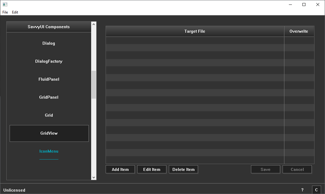
GridView Component
A **grid table** is a structured UI component that displays data in a tabular format using a grid layout of rows and columns. Each cell in the table holds individual pieces of information, allowing users to easily scan, compare, and analyze data. Grid tables often include features such as sortable columns, filtering, pagination, and selectable rows to enhance data interaction and usability. Commonly used in dashboards, data management systems, and reporting tools, grid tables provide a clear and organized way to present complex datasets. They can be styled for readability with alternating row colors, fixed headers, and responsive behavior to adapt across different screen sizes and devices.
class GridViewDemo : public GridPanel, public GridViewListener
{
	GridView _gridView;

public:

	GridViewDemo()
	{
		_gridView.addColumn(L"TargetFile",L"Target File", TRUE, -1);
		_gridView.addColumn(L"Overwrite", L"Overwrite", TRUE, 100);
		_gridView.setListener(this);
		_gridView.enableInlineEditing(TRUE);

		setLayout({ -1 }, { -1 });
		addComponent(&_gridView, 0, 0);
	}

	~GridViewDemo()
	{
	}

	void onCreateItem(long sourceId)
	{
		/*
		FileEntryDialog dlg;

		dlg.setVisible(getWindowHandle());
		if (dlg.getExitCode() == DIALOG_OK)
		{
			long rowIndex = _filesPanel.addRow();
			if (rowIndex >= 0)
			{
				_filesPanel.setCellValue(rowIndex, 0, dlg._targetFile);
				_filesPanel.setCellValue(rowIndex, 1, dlg._override ? L"Yes" : L"No");
			}
		}
		*/
	}

	void onEditItem(long sourceId, __int64 rowIndex)
	{
		/*
		FileEntryDialog dlg;

		dlg._targetFile = _filesPanel.getCellValue(rowIndex, 0);
		dlg._override = _filesPanel.getCellValue(rowIndex, 1) == L"Yes";

		dlg.setVisible(getWindowHandle());
		if (dlg.getExitCode() == DIALOG_OK)
		{
			_filesPanel.setCellValue(rowIndex, 0, dlg._targetFile);
			_filesPanel.setCellValue(rowIndex, 1, dlg._override ? L"Yes" : L"No");
		}
		*/
	}

	BOOL onDeleteItem(long sourceId, __int64 rowIndex)
	{
		if (MessageBox(NULL, L"Are you sure you want to delete the selected file?", L"Confirm Deletion", MB_YESNO) == IDYES)
		{
			// TODO: Delete the row
			return TRUE;
		}
		return FALSE;
	}

	void onItemCreated(long sourceId, __int64 rowIndex, const vector& rowValues)
	{

	}

	void onItemUpdated(long sourceId, __int64 rowIndex, const vector& rowValues)
	{

	}
};
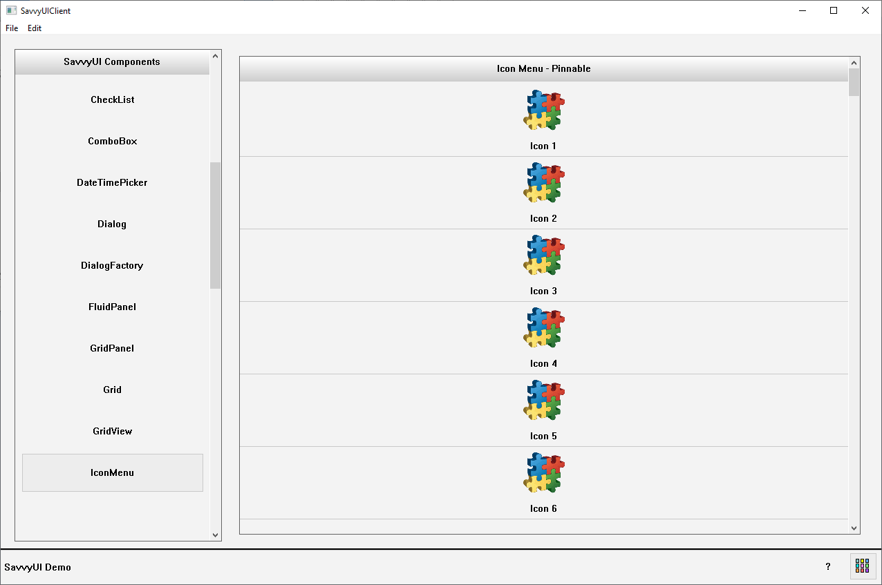
IconMenu Component
A **vertical icon menu** is a user interface component that displays a series of clickable icons arranged in a single vertical column. Each icon represents a distinct action, tool, or navigation option, providing users with a space-efficient and visually clear way to access features or pages. This vertical alignment is especially useful for sidebars, navigation panels, or tool palettes where screen width is limited or where a natural top-to-bottom flow enhances usability. Vertical icon menus often include hover or focus states, and sometimes labels or tooltips to clarify icon meanings, improving accessibility. They help organize functionality in a neat, easily scannable format, making them ideal for both desktop and mobile interfaces.
class IconMenuDemo : public GridPanel, public SelectionChangeListener
{
	IconMenu _iconMenu;

public:

	IconMenuDemo()
	{
		_iconMenu.setTitle(L"Icon Menu - Pinnable");
		for (long i = 1; i < 100; i++)
		{
			wchar_t szText[255];
			swprintf_s(szText, 254, L"Icon %d", i);
	//        _iconMenu.addItem(L"C:/EzPointOfSale/images/closeshift.gif", szText);
			_iconMenu.addItem(IDR_LOGO_PNG, ImageType::PNG, szText);
		}
	//    _iconMenu.setPinnable(TRUE);
		_iconMenu.addSelectionChangedListener(this);

		setLayout({ -1 }, { -1 });
		addComponent(&_iconMenu, 0, 0);
	}

	~IconMenuDemo()
	{
	}

	void onSelectionChanged(const SelectionChangeEvent& ev)
	{
		DialogFactory::showInfo(this, ev.selectionValue, L"Icon Menu Selection");
	}
};
ListBox Component
A **listbox** is a user interface component that displays a scrollable list of items from which users can select one or multiple options. It typically shows several items at once, allowing users to navigate through the list using a mouse, or keyboard, input. Listboxes are commonly used in forms, settings panels, and selection dialogs where presenting a large set of choices in a compact, easy-to-scan format is needed. They can support single or multiple selection modes and often include features like search, grouping, and keyboard navigation to improve usability and accessibility.
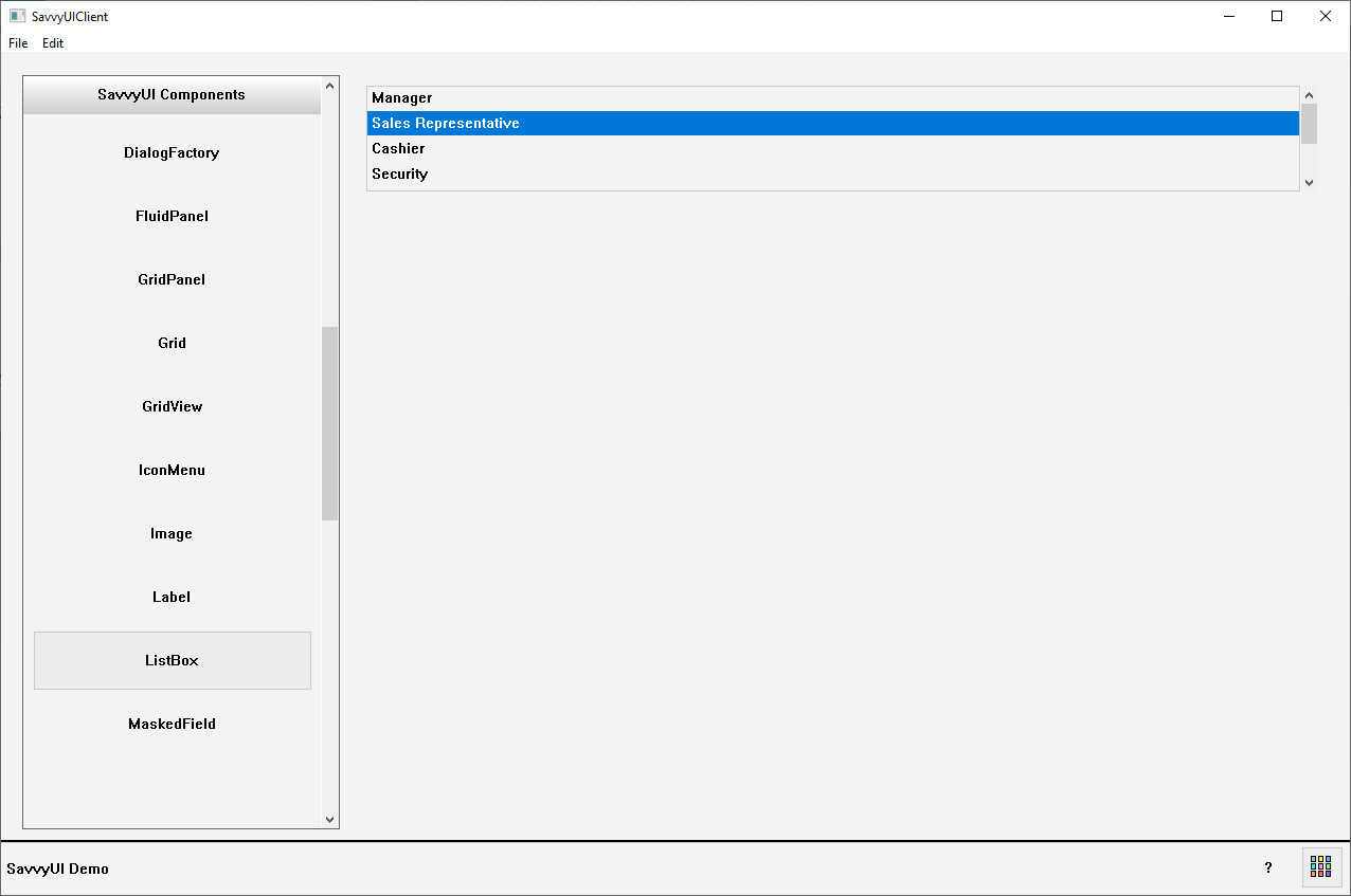
class ListBoxDemo : public GridPanel, public SelectionChangeListener
{
	ListBox _listbox;

public:

	ListBoxDemo()
	{
		_listbox.addItem(L"Manager");
		_listbox.addItem(L"Sales Representative");
		_listbox.addItem(L"Cashier");
		_listbox.addItem(L"Security");
		_listbox.addItem(L"Clerk");
		_listbox.addItem(L"Accountant");
		_listbox.addItem(L"CEO");
		_listbox.addSelectionChangedListener(this);

		setLayout({ -1 }, { 100, -1 });
		addComponent(&_listbox, 0, 0);
	}

	~ListBoxDemo()
	{
	}

	void onSelectionChanged(const SelectionChangeEvent& ev)
	{
		DialogFactory::showInfo(this, ev.selectionValue, L"ListBox Selection Change");
	}
};
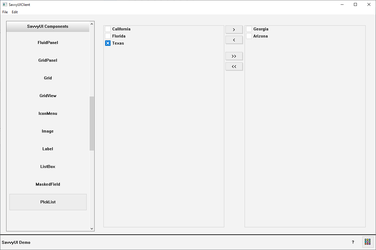
PickList Component
A **picklist with two lists** (also known as a dual-listbox or multi-select transfer list) is a UI component that displays two side-by-side lists—one showing available options and the other showing selected items. Users can move items back and forth between the lists using buttons, allowing easy selection and management of multiple choices from a larger pool. This component is ideal for scenarios where users need to select multiple options without cluttering the interface, such as assigning users to groups, selecting preferences, or managing features. The dual-list layout provides clear visual separation between chosen and unchosen items, improving usability and control over selections.
class PickListDemo : public GridPanel
{
	PickList _pickList;

public:

	PickListDemo()
	{
		vector selectableItems, selectedItems;
		selectableItems.push_back(KeyValue(L"1", L"California"));
		selectableItems.push_back(KeyValue(L"2", L"Florida"));
		selectableItems.push_back(KeyValue(L"3", L"Georgia"));
		selectableItems.push_back(KeyValue(L"4", L"Arizona"));
		selectableItems.push_back(KeyValue(L"5", L"Texas"));

		_pickList.setSelectableItems(selectableItems);
		_pickList.setSelectedItems(selectedItems);

		setLayout({ -1 }, { -1 });
		addComponent(&_pickList, 0, 0);
	}

	~PickListDemo()
	{
	}
};
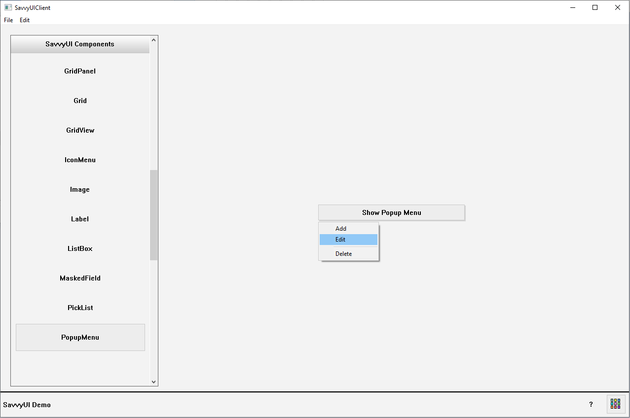
PopupMenu
A **popup menu** is a contextual user interface element that appears temporarily on top of the current screen or application content, typically triggered by a right-click, tap, or specific user interaction. It presents a list of options or actions relevant to the current context, allowing users to quickly choose commands without navigating away from their current task. Popup menus are commonly used for shortcuts, tool options, or additional settings, and often disappear automatically after a selection is made or when the user clicks outside the menu. Designed to be lightweight and unobtrusive, popup menus enhance usability by providing quick access to contextual functions while keeping the interface clean.
class PopupMenuDemo : public GridPanel, public ActionListener
{
	Button _trigger;

public:

	PopupMenuDemo()
	{
		_trigger.setText(L"Show Popup Menu");
		_trigger.addActionListener(this);

		setLayout({ -1, 300, -1 }, { -1, 35, -1 });
		addComponent(&_trigger, 1, 1);
	}

	~PopupMenuDemo()
	{
	}

	void onAction(const ActionEvent& ev)
	{
		if (ev.sourceComponentId == _trigger.getId())
		{
			PopupMenu pMenu;
			pMenu.addItem(1, L"Add");
			pMenu.addItem(2, L"Edit");
			pMenu.addSeparator();
			pMenu.addItem(3, L"Delete");

			Bounds rect;
			_trigger.GetWindowRect(rect);
			POINT pt = { rect.left, rect.bottom };
			ScreenToClient(getWindowHandle(), &pt);
			long selection = pMenu.showMenu(getWindowHandle(), pt.x, pt.y);
			if (selection == 1) {
				DialogFactory::showInfo(this, L"Add", L"Selection");
			}
			else if (selection == 2) {
				DialogFactory::showInfo(this, L"Edit", L"Selection");
			}
			else if (selection == 3) {
				DialogFactory::showInfo(this, L"Delete", L"Selection");
			}
		}
	}
};
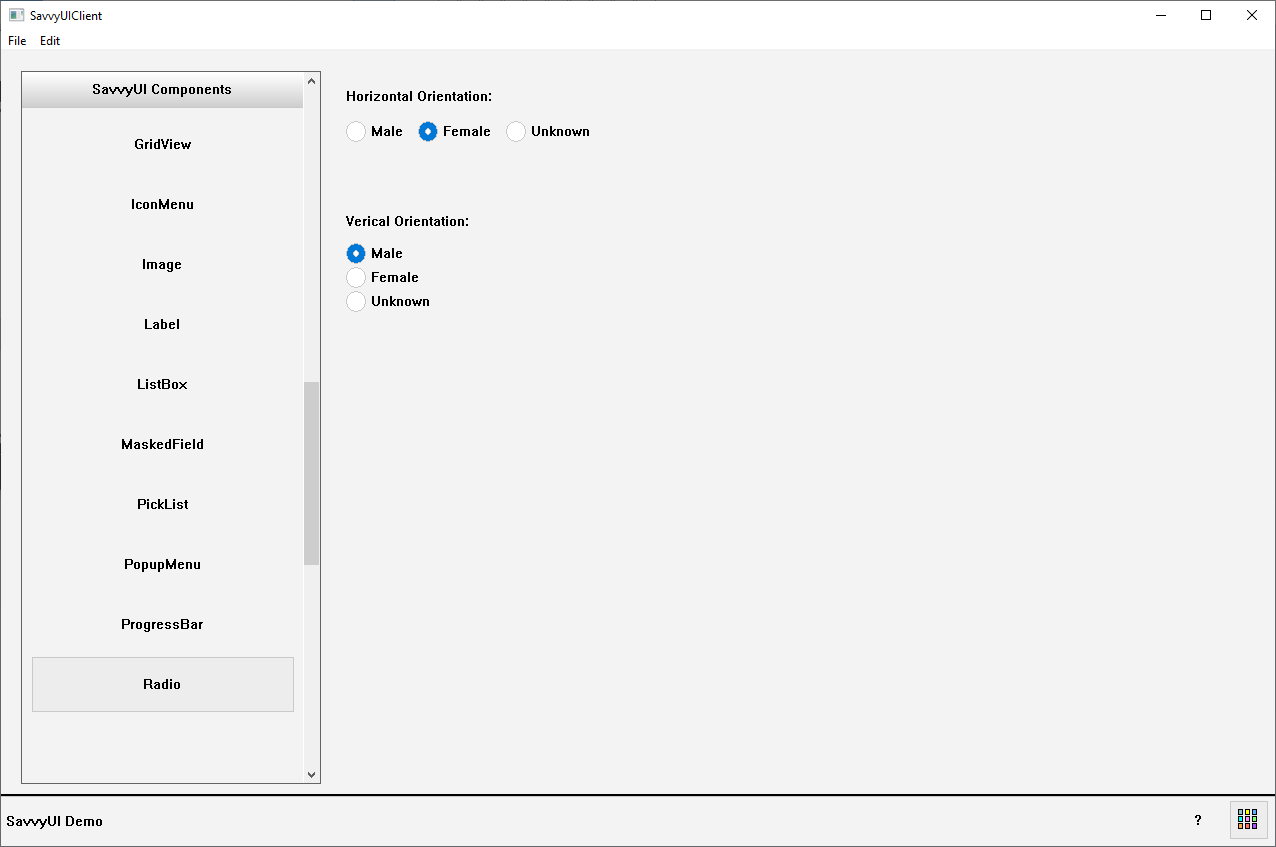
Radio Component
A **radio group** is a user interface component that presents a set of related options where only one option can be selected at a time. It consists of multiple radio buttons grouped together, each representing a single choice within a category. Selecting one radio button automatically deselects any previously selected option in the same group. Radio groups are commonly used in forms and surveys to gather exclusive choices—such as gender selection, payment methods, or preference settings. They improve clarity by visually grouping mutually exclusive options, and when properly labeled, they enhance accessibility for all users.
class RadioDemo : public GridPanel, public SelectionChangeListener
{
	Label _labelVert;
	Radio _radioGroupVert;
	Label _labelHorz;
	Radio _radioGroupHorz;

public:

	RadioDemo()
	{
		_labelHorz.setText(L"Horizontal Orientation:");
		addComponent(&_labelHorz, 0, 0);
		_radioGroupHorz.setOrientation(L"HORZ");
		_radioGroupHorz.addOption(L"M", L"Male");
		_radioGroupHorz.addOption(L"F", L"Female");
		_radioGroupHorz.addOption(L"U", L"Unknown");
		_radioGroupHorz.addSelectionChangedListener(this);
		addComponent(&_radioGroupHorz, 0, 1);

		_labelVert.setText(L"Verical Orientation:");
		addComponent(&_labelVert, 0, 3);
		_radioGroupVert.setOrientation(L"VERT");
		_radioGroupVert.addOption(L"M", L"Male");
		_radioGroupVert.addOption(L"F", L"Female");
		_radioGroupVert.addOption(L"U", L"Unknown");
		_radioGroupVert.addSelectionChangedListener(this);
		addComponent(&_radioGroupVert, 0,4);

		setLayout({ -1 }, { 30, 30, 50, 30, 100, -1 });
	}

	~RadioDemo()
	{
	}

	void onSelectionChanged(const SelectionChangeEvent& ev)
	{
		DialogFactory::showInfo(this, ev.selectionValue, L"Radio Selection Change");
	}
};
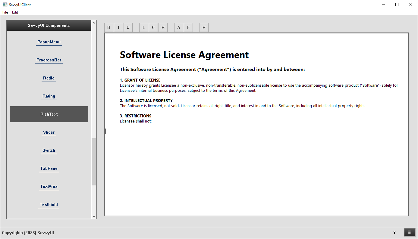
Rich Text Edit Component
A **rich text edit** component is an interactive UI element that allows users to apply various types of formatting and styling to text. This component is a text editor with powerful text formatting features built into the component.
class RichTextDemo : public GridPanel
{
	RichText _richText;

public:

	RichTextDemo()
	{
		setLayout({ -1 }, { -1 });
		addComponent(&_richText, 0, 0);

		_richText.setText(L"This is a rich text edit component");
	}

	~RichTextDemo()
	{
	}
};
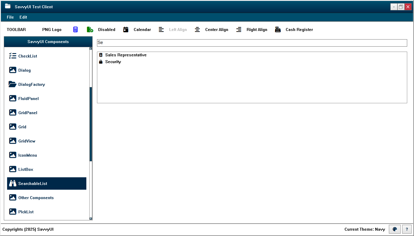
Searchable List Component
The SearchableList component is similar to the ListBox component, with the added capability of filtering list items through an integrated text field where users can enter search criteria.
Tabbed Pane Component
A **tabbed pane** is a user interface component that organizes content into multiple sections, each accessible through labeled tabs arranged typically at the top or side of the pane. Only one tab’s content is visible at a time, allowing users to switch between different views or categories without navigating away from the current screen. Tabbed panes help manage complex or related information in a compact space, improving navigation and reducing clutter. Commonly used in settings panels, dashboards, and multi-section forms, they provide a clear structure and easy access to different content areas while maintaining context. Well-designed tabbed panes support keyboard navigation and accessibility for a seamless user experience.
class TabPaneDemo : public GridPanel
{
	TabPane _tabPane;

	ButtonDemo _buttonDemo;
	ButtonGridDemo _buttonGridDemo;
	ButtonMenuDemo _buttonMenuDemo;
	TreeViewDemo _treeViewDemo;

public:

	TabPaneDemo()
	{
		_tabPane.addTab(L"Tree View", &_treeViewDemo);
		_tabPane.addTab(L"Buttons", &_buttonDemo);
		_tabPane.addTab(L"Button Grid", &_buttonGridDemo);
		_tabPane.addTab(L"Button Menu", &_buttonMenuDemo);

		setMargin(0);
		setLayout({ -1 }, { -1 });
		addComponent(&_tabPane, 0, 0);
	}

	~TabPaneDemo()
	{
	}
};
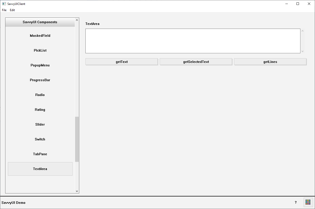
TextArea Component
A **text area** is a user interface component that provides a larger, multi-line input field where users can enter, edit, and review extended blocks of text. Unlike a single-line text input, text areas are ideal for capturing longer responses such as comments, descriptions, messages, or feedback. Text areas often include features like resizing, scrollbars, and placeholder text to guide user input. They can support rich text formatting or plain text depending on the application. By offering ample space for detailed input, text areas enhance usability in forms, chat interfaces, and content creation tools.
class TextAreaDemo : public GridPanel, public ActionListener
{
	Label _textAreaLabel;
	TextArea _textArea;

	Button _getTextButton, _getSelectedTextButton, _getLinesButton;

public:

	TextAreaDemo()
	{
		_getTextButton.setText(L"getText");
		_getTextButton.addActionListener(this);
		_getSelectedTextButton.setText(L"getSelectedText");
		_getSelectedTextButton.addActionListener(this);
		_getLinesButton.setText(L"getLines");
		_getLinesButton.addActionListener(this);

		_textAreaLabel.setText(L"TextArea");
		addComponent(&_textAreaLabel, 0, 0, 3);
		addComponent(&_textArea, 0, 1, 3);

		addComponent(&_getTextButton, 0, 3);
		addComponent(&_getSelectedTextButton, 1, 3);
		addComponent(&_getLinesButton, 2, 3);

		setLayout({ -1, -1, -1 }, { 30, 100, 10, 30, -1 });
	}

	~TextAreaDemo()
	{
	}

	void onAction(const ActionEvent& ev)
	{
		if (ev.actionName == L"getText") {
			DialogFactory::showInfo(this, _textArea.getText());
		} else if (ev.actionName == L"getSelectedText") {
			DialogFactory::showInfo(this, _textArea.getSelectedText());
		} else if (ev.actionName == L"getLines") {
			vector lines;
			_textArea.getLines(lines);
			wstring combinedText = L"";
			for (size_t i = 0; i < lines.size(); i++) {
				combinedText += lines[i];
				combinedText += L"\n";
			}
			DialogFactory::showInfo(this, combinedText);
		}
	}
};
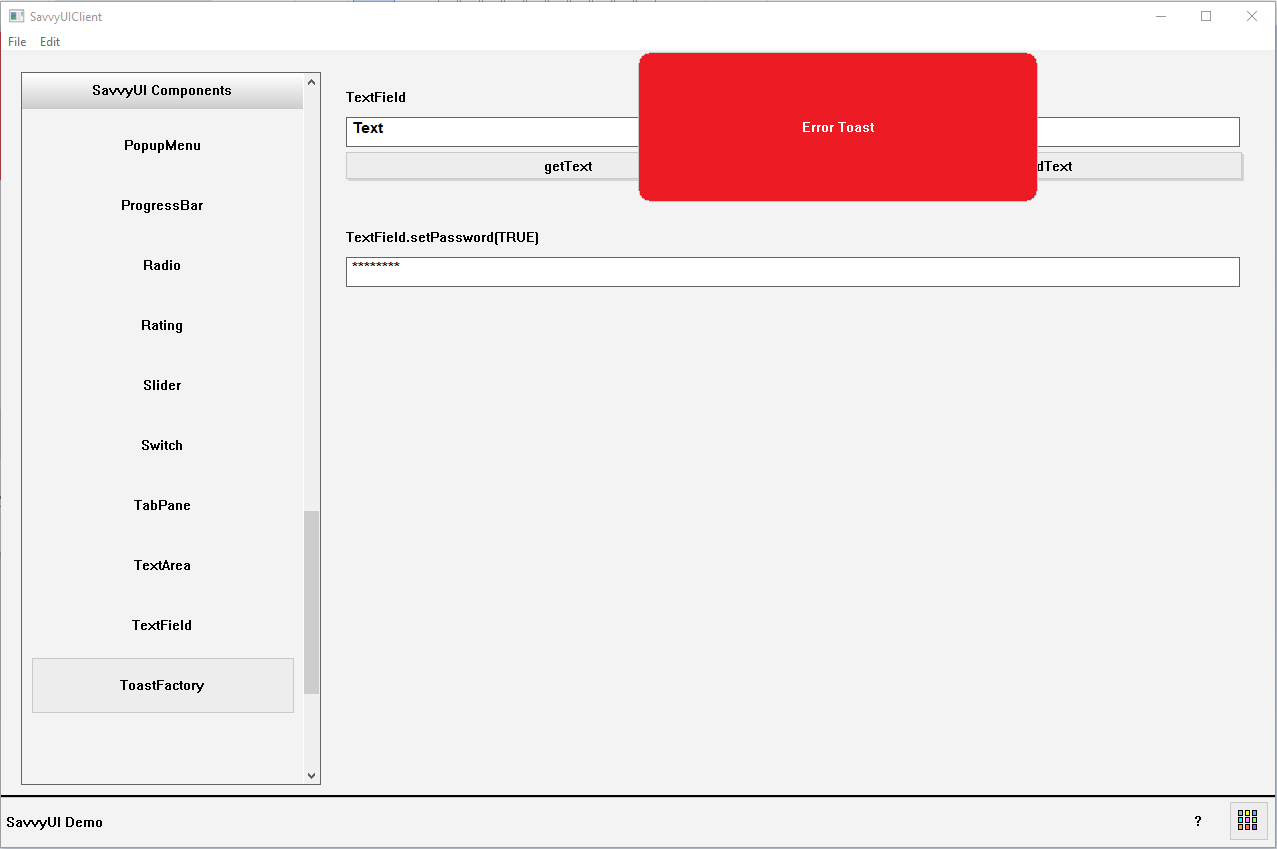
ToastFactory Component
A **ToastFactory** is a utility or design pattern used in software development to create and manage toast notifications—small, temporary messages that appear on the screen to provide feedback or alerts without interrupting the user’s workflow. The ToastFactory centralizes the creation of toast messages, ensuring consistency in styling, behavior, duration, and placement across an application. Instead of manually building each toast notification, developers can use the factory to quickly generate toasts by specifying parameters like message text, type (success, error, info), and display duration. This approach promotes reusable, maintainable code and a unified user experience.
Tooltip Component
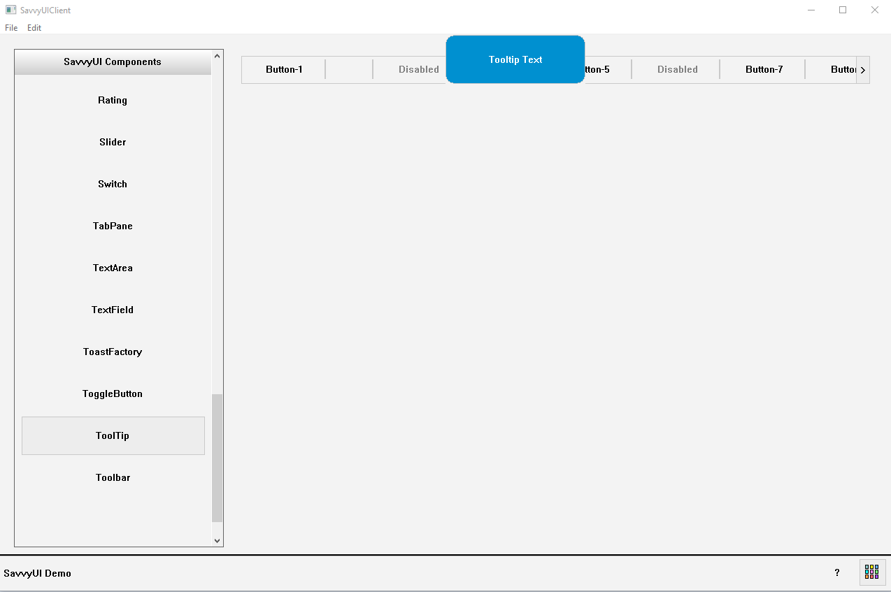
A **tooltip** is a small, informative popup that appears when a user hovers over, focuses on, or taps an element in a user interface. It provides additional context, explanations, or helpful hints about the element without cluttering the main UI. Tooltips are commonly used to clarify icons, buttons, form fields, or other controls—especially when their purpose might not be immediately obvious. They typically display concise text, appear near the target element, and disappear when the user moves away. Well-designed tooltips improve usability and accessibility by offering guidance just when it’s needed, enhancing the overall user experience.
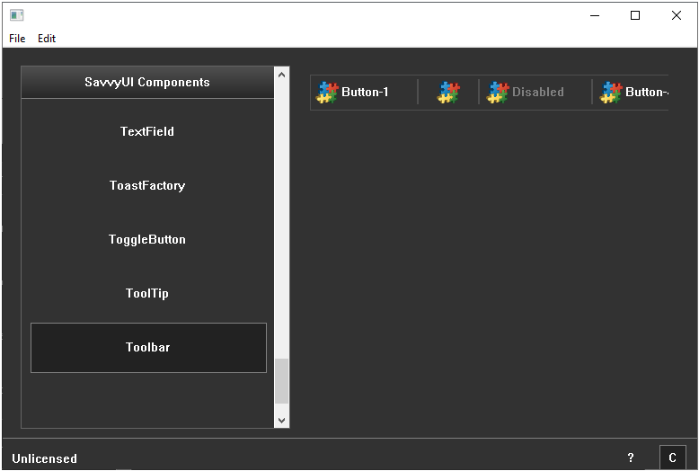
Toolbar Component
A **buttons/icons toolbar** is a horizontal or vertical interface component that groups a collection of clickable buttons or icons, providing quick access to commonly used actions or tools within an application. Each button or icon represents a specific function—like formatting options, navigation controls, or commands—allowing users to perform tasks efficiently without navigating through menus. Toolbars are often customizable, support tooltips for clarity, and may include separators or grouping to organize related actions. They enhance productivity by keeping important features readily accessible, and their compact design helps maintain a clean and intuitive interface across desktop and mobile environments
class ToolbarDemo : public GridPanel, public ActionListener
{
	Toolbar _toolbar;

public:

	ToolbarDemo()
	{
		_toolbar.addItem(1, L"Button-1", IconSource(L"logo.png"));
		_toolbar.addItem(2, L"", IconSource(L"logo.png"));
		_toolbar.addItem(3, L"Disabled", IconSource(L"logo.png"));
		_toolbar.addItem(4, L"Button-4", IconSource(L"logo.png"));
		_toolbar.addItem(5, L"Button-5", IconSource(L"logo.png"));
		_toolbar.addItem(6, L"Disabled", IconSource(L"logo.png"));
		_toolbar.addItem(7, L"Button-7", IconSource(L"logo.png"));
		_toolbar.addItem(8, L"Button-8", IconSource(L"logo.png"));
		_toolbar.addItem(9, L"Button-9", IconSource(L"logo.png"));
		_toolbar.addItem(10, L"Button-10", IconSource(L"logo.png"));
		_toolbar.addActionListener(this);

		_toolbar.enableItem(3, FALSE);
		_toolbar.enableItem(6, FALSE);

		setLayout({ -1 }, { 40, -1 });
		addComponent(&_toolbar, 0, 0);
	}

	~ToolbarDemo()
	{
	}

	void onAction(const ActionEvent& ev)
	{
		DialogFactory::showInfo(this, ev.actionName, L"Toolbar action");
	}
};
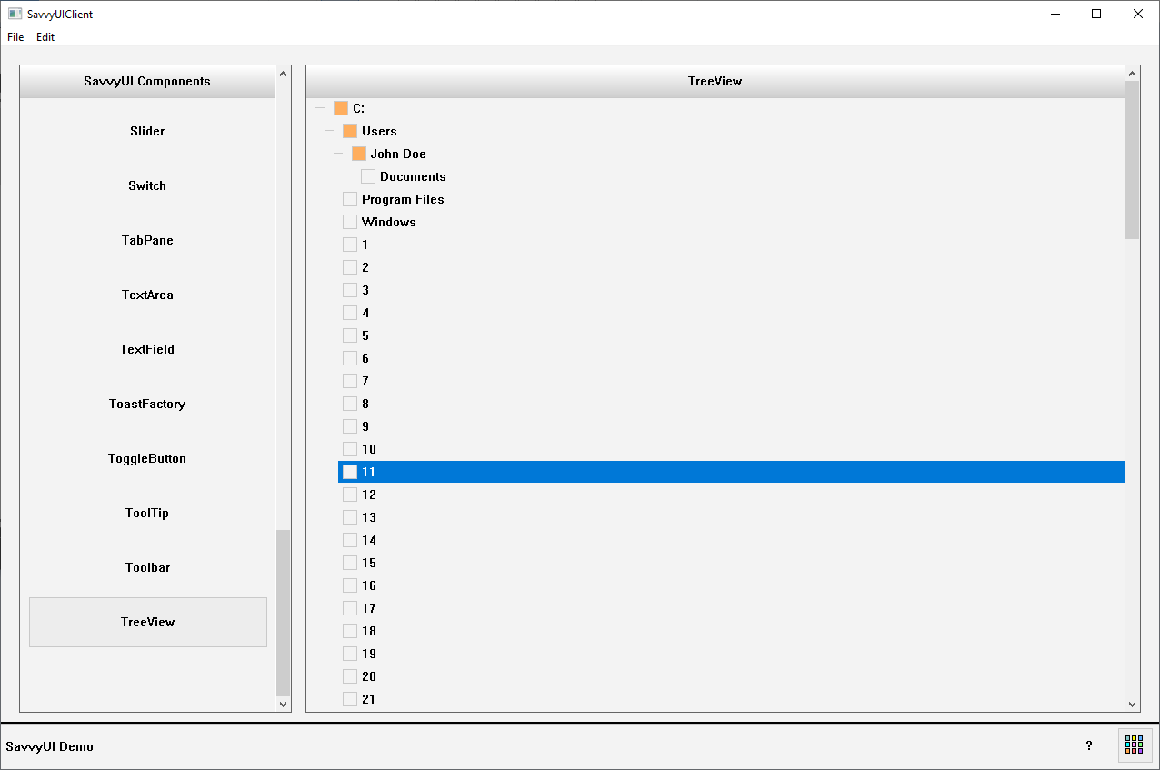
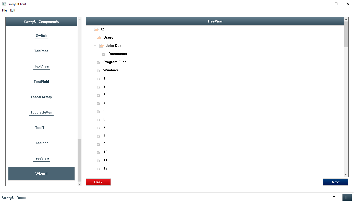
Treeview Component
A **treeview** is a hierarchical user interface component that displays data or items in a nested, expandable list structure resembling a tree. Each item, or “node,” can have child nodes, allowing users to drill down into multiple levels of information by expanding or collapsing branches. Treeviews are commonly used for navigating file systems, organizational charts, menus, or any data that has parent-child relationships. They help users explore complex structures in a clear, organized way, making it easier to find and manage information without overwhelming the screen. Good treeviews support keyboard navigation, dynamic loading, and accessibility to enhance usability.
class TreeViewDemo : public GridPanel, public SelectionChangeListener
{
	TreeView _treeView;

public:

	TreeViewDemo()
	{
		_treeView.clear();
		_treeView.setTitle(L"TreeView");

		_treeView.addItem(L"C:", L"C:");
		_treeView.addItem(L"Users", L"Users", L"C:");
		_treeView.addItem(L"John Doe", L"John Doe", L"Users");
		_treeView.addItem(L"Documents", L"Documents", L"John Doe");
		_treeView.addItem(L"Program Files", L"Program Files", L"C:");
		_treeView.addItem(L"Windows", L"Windows", L"C:");
		wchar_t id[100];
		for (long i = 1; i < 100; i++)
		{
			_ltow_s(i, id, 100, 10);
			_treeView.addItem(id, id, L"C:");
		}

		setMargin(0);
		setLayout({ -1 }, { -1 });
		addComponent(&_treeView, 0, 0);
	}

	~TreeViewDemo()
	{
	}

	void onSelectionChanged(const SelectionChangeEvent& ev)
	{
	//    DialogFactory::showInfo(getWindowHandle(), ev.selectionValue, L"Item Selected");
	}
};
Wizard Component
A **wizard** is a component which provides a user interface that allows a user to step through a series of screens in order to fill out forms, or view screens in a sequential manner.
class WizardDemo : public GridPanel
{
	Wizard _wizard;

	ButtonDemo _buttonDemo;
	ButtonGridDemo _buttonGridDemo;
	ButtonMenuDemo _buttonMenuDemo;
	TreeViewDemo _treeViewDemo;

public:

	WizardDemo()
	{
		_wizard.addPanel(&_treeViewDemo);
		_wizard.addPanel(&_buttonDemo);
		_wizard.addPanel(&_buttonGridDemo);
		_wizard.addPanel(&_buttonMenuDemo);

		setMargin(0);
		setLayout({ -1 }, { -1 });
		addComponent(&_wizard, 0, 0);
	}

	~WizardDemo()
	{
	}
};
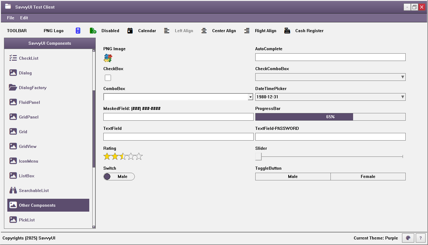
Other Components
In addition to the complex components described above, this library also includes a variety of other components. While simple in design, they are powerful and highly useful, enabling the creation of complete and fully featured applications. These components serve as the foundational building blocks of most application screens, allowing the capture of critical user information needed to manage profile records for customers, suppliers, employees, orders, and more. Examples of these components include text fields, password fields, dropdowns, checkboxes, rating components, masked fields, sliders, switches, toggle buttons, dropdown checklists, and others.